Floating panel
React content in a panel over the map: drag between detents, filter, go to places (iOS).
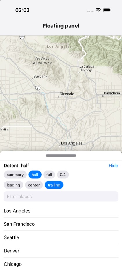
This is the real source of the example app’s toolkit/floating-panel screen — run it on a device
or simulator to see it live.
import { useMemo, useState } from 'react';import { FlatList, Pressable, StyleSheet, Text, TextInput, View } from 'react-native';import { Map, MapView, type Viewpoint } from 'expo-arcgis';import { FloatingPanel, type FloatingPanelDetent } from 'expo-arcgis-toolkit';
const PLACES: { name: string; viewpoint: Viewpoint }[] = [  { name: 'Los Angeles', viewpoint: { latitude: 34.05, longitude: -118.24, scale: 300_000 } },  { name: 'San Francisco', viewpoint: { latitude: 37.77, longitude: -122.42, scale: 200_000 } },  { name: 'Seattle', viewpoint: { latitude: 47.61, longitude: -122.33, scale: 200_000 } },  { name: 'Denver', viewpoint: { latitude: 39.74, longitude: -104.99, scale: 200_000 } },  { name: 'Chicago', viewpoint: { latitude: 41.88, longitude: -87.63, scale: 250_000 } },  { name: 'New York', viewpoint: { latitude: 40.71, longitude: -74.0, scale: 200_000 } },  { name: 'Miami', viewpoint: { latitude: 25.76, longitude: -80.19, scale: 200_000 } },  { name: 'Austin', viewpoint: { latitude: 30.27, longitude: -97.74, scale: 200_000 } },];
const DETENTS: FloatingPanelDetent[] = ['summary', 'half', 'full', { fraction: 0.4 }];const ALIGNMENTS = ['leading', 'center', 'trailing'] as const;
function detentLabel(detent: FloatingPanelDetent): string {  if (typeof detent === 'string') return detent;  return 'fraction' in detent ? `${detent.fraction}` : `${detent.height}pt`;}
/** * The ArcGIS Toolkit's floating panel over the map, with React content: places to go to, and a field * to filter them (the panel moves up with the keyboard). Drag the handle between detents, or pick * one; the map takes the touches outside the panel. Outside portrait (iPad, landscape) the panel * floats at the top, aligned as picked. */export default function FloatingPanelSample() {  const [detent, setDetent] = useState<FloatingPanelDetent>('half');  const [alignment, setAlignment] = useState<(typeof ALIGNMENTS)[number]>('trailing');  const [isPresented, setIsPresented] = useState(true);  const [viewpoint, setViewpoint] = useState<Viewpoint>(PLACES[0].viewpoint);  const [filter, setFilter] = useState('');  const places = useMemo(    () => PLACES.filter((place) => place.name.toLowerCase().includes(filter.toLowerCase())),    [filter]  );  return (    <Map basemap="arcGISTopographic" initialViewpoint={PLACES[0].viewpoint}>      <MapView style={{ flex: 1 }} viewpoint={viewpoint}>        <FloatingPanel          isPresented={isPresented}          selectedDetent={detent}          onSelectedDetentChange={setDetent}          horizontalAlignment={alignment}>          <View style={styles.panel}>            <View style={styles.row}>              <Text style={styles.label}>Detent: {detentLabel(detent)}</Text>              <Pressable onPress={() => setIsPresented(false)}>                <Text style={styles.link}>Hide</Text>              </Pressable>            </View>            <View style={styles.row}>              {DETENTS.map((item) => (                <Chip                  key={detentLabel(item)}                  label={detentLabel(item)}                  selected={detentLabel(item) === detentLabel(detent)}                  onPress={() => setDetent(item)}                />              ))}            </View>            <View style={styles.row}>              {ALIGNMENTS.map((item) => (                <Chip                  key={item}                  label={item}                  selected={item === alignment}                  onPress={() => setAlignment(item)}                />              ))}            </View>            <TextInput              style={styles.input}              placeholder="Filter places"              value={filter}              onChangeText={setFilter}              clearButtonMode="while-editing"            />            <FlatList              style={{ flex: 1 }}              data={places}              keyExtractor={(place) => place.name}              keyboardShouldPersistTaps="handled"              renderItem={({ item }) => (                <Pressable style={styles.place} onPress={() => setViewpoint(item.viewpoint)}>                  <Text style={styles.placeText}>{item.name}</Text>                </Pressable>              )}            />          </View>        </FloatingPanel>        {!isPresented && (          <Pressable style={styles.show} onPress={() => setIsPresented(true)}>            <Text style={styles.showText}>Show panel</Text>          </Pressable>        )}      </MapView>    </Map>  );}
function Chip({  label,  selected,  onPress,}: {  label: string;  selected: boolean;  onPress: () => void;}) {  return (    <Pressable style={[styles.chip, selected && styles.chipSelected]} onPress={onPress}>      <Text style={[styles.chipText, selected && styles.chipTextSelected]}>{label}</Text>    </Pressable>  );}
const styles = StyleSheet.create({  panel: { flex: 1, paddingHorizontal: 12, paddingTop: 8, gap: 8 },  row: { flexDirection: 'row', alignItems: 'center', gap: 6, flexWrap: 'wrap' },  label: { flex: 1, fontSize: 15, fontWeight: '600' },  link: { fontSize: 15, color: '#007aff' },  chip: {    paddingHorizontal: 10,    paddingVertical: 5,    borderRadius: 14,    backgroundColor: '#e5e5ea',  },  chipSelected: { backgroundColor: '#007aff' },  chipText: { fontSize: 13, color: '#1c1c1e' },  chipTextSelected: { color: 'white' },  input: {    borderRadius: 8,    backgroundColor: '#f2f2f7',    paddingHorizontal: 10,    paddingVertical: 8,    fontSize: 15,  },  place: {    paddingVertical: 12,    borderBottomWidth: StyleSheet.hairlineWidth,    borderColor: '#c6c6c8',  },  placeText: { fontSize: 16 },  show: {    position: 'absolute',    bottom: 40,    alignSelf: 'center',    backgroundColor: 'white',    paddingHorizontal: 16,    paddingVertical: 10,    borderRadius: 20,    shadowColor: 'black',    shadowOpacity: 0.2,    shadowRadius: 6,    shadowOffset: { width: 0, height: 2 },  },  showText: { fontSize: 15, fontWeight: '600', color: '#007aff' },});